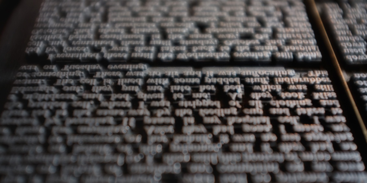
Optimize for legibility.
Hi bloggers! My name’s Kjell Reigstad, and I’m a designer at Automattic. This is part seven in my monthly series on “The Principles of Design.” In this series, I share some of the basic tenets of design, and we explore how to apply them to your blog.
Previous installments:
Clarity
Visual Hierarchy
Color Harmony
Design Iteration & Feedback
Accessibility
Choosing Fonts
Last month, we talked about Choosing Fonts for your blog. Today we’re going to take things a step further and discuss best practices for getting the most out of those fonts.
For the entirity of my first typography class in college, I used just one typeface. This stuck me as odd originally, but it taught me a very important lesson.
On the first day of class, we were provided with the first paragraph of A Tale of Two Cities by Charles Dickens, and a very restrictive homework assignment:
- Create 30 different treatments of the text within a 6-inch by 6-inch white square.
- You must use Univers Medium at 12pt.
- All text must be black.
- No other fonts, weights, styles, colors, or sizes are allowed.
- No additional graphic elements are allowed.
- The text must remain in paragraph form, and it must be readable.
In class the following week, we reviewed everyone’s variations together. Though the assignment seemed daunting at first, we produced a huge variety of options. Subtle changes can have substantial effects on readability and impression of text.

We tackled that same homework assignment each week for the rest of the semester, but with a slowly expanding toolset. Week two we were allowed to use Univers Italic. Week three we were allowed to use Univers Bold. Week four we were allowed to introduce a second type size (14pt). And so on throughout the 15-week course.
By the end of the semester, we learned that typography isn’t about choosing fonts, it’s about using fonts. Fonts are a tool, and as a designer it’s very important to learn how to wield them well.
Typography on Your Blog
On your blog, you have an obvious incentive for using your fonts well: great typography makes it easier for people to read what you have to say! At its core, the key to readable typography is just ensuring that your reader’s eyes don’t have to work too hard. Below are a few standard, subtle typographic techniques that can help you present beautiful, easy-to-read text.
Scale
As noted in my accessibility post, I try to set a minimum of 14pt for body text. Also, don’t forget to ensure that your text has a color contrast against its background.
Type size is something we’re all very aware of: tiny text is difficult to read. Text scale however might be a new concept. Scale is what establishes visual hierarchy in text– it refers to the spread of different type sizes used throughout a site. On WordPress.com, you’ll notice that a text scale is already baked into your site’s theme through header styles. If you have a longer post that you want to break up into smaller chunks, sometimes it helps to implement some scale into your entry. Try using the largest header size for your main sections, the next smallest for sub-sections, and so on. This helps break up long passages of text, and will guide readers thorough your content.

You can use header styles to introduce hierarchy to longer posts, and to help guide readers through your content. (Check out the headers in this post for example!).
Emphasis
When adding emphasis to your text, I always subscribe to the “less is more” mantra. As I learned in my first typography class: a small change can go a long way. If you want a word or phrase to stand out, there’s often no need to apply multiple style adjustments. In other words, don’t use big, bright, bold, italic text when just bold will do. If you integrate too many distractions, you’ll risk breaking the flow of the paragraph.

Try to provide emphasis without distracting the reader from the flow of the paragraph.
Alignment
The structure of your paragraphs can massively impact readability as well. Take alignment for example: for languages that read left-to-right, right aligning or centering your text can reduce readability. It’s usually fine for small bits of text (think headers or captions), but you usually wouldn’t want to do it for an entire paragraph. Also, jumping back and forth between left- and right-aligned text can be tiresome for readers, so try to keep your alignment consistent.

The left-aligned paragraph at the left is more natural to read than the right-aligned version.
Leading
Leading (also known as “line-spacing”) is a term that dates back to typesetting for a printing press. To achieve optimal readability, typographers would place a carefully-chosen piece of lead to place in between lines of metal or wooden type. Lines with too much (or too little) spacing are hard to read, so this was meant to strike a visual balance. This fine-tuning is still important today. Usually your theme will have good leading by default, but bloggers with the WordPress.com Premium plan can perform their own adjustments using the line-height CSS property.

Text can become jumbled (far left) or exhausting to read (far right) if the leading isn’t balanced.
Additional Resources
The tips above are really just the tip of the iceberg. If you’d like to go more in-depth with typography, here are a few resources that might be helpful:
- First of all, great typography is everywhere! Take note of sites that you love to read, and also take inspiration from tried-and-true newspaper design: The New York Times for instance. Online, Discover.typography and Fontsinuse are great places to browse through excellent typography.
- Fontshop’s Glossary can help introduce you to common typographic terms.
- Matthew Butterick’s “Summary of Key Rules” outlines a few more typographic suggestions.
- If you’d like to go really in-depth, The Elements of Typographic Style by Robert Bringhurst is the de-facto book on typography. There’s a related project you can check out for free online at webtypography.org.
Since so many of these guidelines rely on a fine-tuned awareness of visual balance, there’s really no better way to learn than experimentation. Try tweaking the way your text looks slightly, and then ask yourself (or a friend) if the change helps or hinders readability.
Do you have other ideas for enhancing readability on your blog? Feel free to share in the comments.
Currently blogless? You’re a click away from sharing your story.
Create your blog at WordPress.com


Paragraphing. Amazing how many people forget the power of proper paragraphing.
LikeLiked by 6 people
Ahhh, so cool! Thanks! My graduate class has been spending time setting the type face from a 10pt California case for an 18th Century book, so this is really cool!
LikeLiked by 3 people
I do a lot of longform pieces, so typography and line-spacing are probably the most important considerations outside of content. I really appreciate the relatively recent introduction of free font styles by WordPress.com – it helped me find a font and a size that works for my chosen theme.
LikeLiked by 4 people
good article…..
LikeLiked by 4 people
Very helpful!
LikeLiked by 2 people
I was actually just playing around with my font. I really like my layout and chosen theme except for the fact that it puts my site title in all caps. I feel like my chosen title font looks odd in all caps. Any thoughts or opinions?
https://beautifullyflawed1012.wordpress.com/
I’m also very new to blogging so if you see anything I should change, be it content or layout, please let me know! Any and all advice is welcome.
LikeLiked by 2 people
Hey there! To get feedback on your blog’s design, try posting a comment in the Community Pool! It runs every week, starting on Mondays.
LikeLiked by 3 people
Thanks!
LikeLiked by 1 person
OK but I would love it you looked at my blog to see all the mistakes I’ve probably made. I’m new to this and I’m sure there are a lot. memanera.wordpress.com Thanks
LikeLiked by 2 people
I’m glad this came up because I am at a loss as to why my blog hyphenates many of the line endings in every post. This only happens using Internet Explorer and Firefox. If you read my blog using Chrome browser or in mobile format its fine but in Internet Explorer, Edge and Firefox it looks really bad. Does anyone have any idea how I can resolve this problem? eg democra-cy , how bad is that? https://stormyweather.wordpress.com/
LikeLiked by 2 people
Hey there! I took a look at your hyphenation issue. The Twenty Fourteen theme is actually built to hyphenate paragraphs that way. It was a design decision made by the theme author, and can be modified only through entering custom CSS (which requires a WordPress.com Premium upgrade).
https://wordpress.com/support/custom-design/editing-css/
If the hyphenation causes issues for you, it might be worth testing some other fonts to see if they fare any better. Otherwise, you can always try out a different theme. When you preview fonts and themes using the Customizer, you’ll be able to see how it handles hyphens in real-time.
https://wordpress.com/support/customizer/
LikeLiked by 2 people
Hi, thanks for your reply. Strange that it doesn’t appear to do it using Chrome browser. Can’t imagine why anyone would want to randomly hyphenate words when it just makes it all grammatically incorrect. I was blissfully unaware until a few weeks ago that this was happening as up to my laptop packing up I had always used Chrome but that doesn’t work too well on Windows 10. Ah well I will look at changing the theme. Thanks once again for your help.
LikeLiked by 1 person
Great reminder to keep it simple – small changes can really make all the difference!
LikeLiked by 2 people
Really helpful! Thank you for sharing this. I will check out the other 6 parts as well 🙂
LikeLiked by 2 people
Super help full! I just started my blog and I’m hoping it looks okay. I pretty much left the defaults in place as I wasn’t sure what to mess around with in order to make it more readable. The story about your home work assignment makes me realized how much typography can effect reading. Any suggestions for my new blog? https://chiropractorbutler.wordpress.com/
LikeLiked by 2 people
Sorry about the misspellings… I hit send too fast. 🙂
LikeLiked by 1 person
Thanks for reading! If you’d like feedback on your blog, a great place to start is by asking in the Community Pool. We open a new Community Pool post every Monday, and there’s usually a great community discussion there.
LikeLiked by 3 people
Personally, I prefer fully justified to simply right or left for general content. Also, if used sparingly, multiple style adjustments can have the same effect as pulling a block quote without having to actually pulling a block quote. With the example given on the left, you have simple emphasized text, but on the right, you have a pseudo block quote.
LikeLiked by 2 people
I personally don’t like block quote at all. I like to have freedom and stroke rhythm. I know that there are times when you will have to use the block, particularly in magazines and newsletters but if I don’t have to I wont.
LikeLiked by 1 person
I somewhat agree. This just struck me as having a similar feel, and didn’t physically rip the quote out of context.
LikeLiked by 1 person
this is very very helpful. thank you!!!
LikeLiked by 2 people
This is a very interesting blog. One that will come in handy in more ways then one. Thank you, I will check in here often
LikeLiked by 2 people
Great tips! I need to email this to myself for future reference!
LikeLiked by 3 people
Awesome article, and this suggest i will do. Thanks
LikeLiked by 2 people
“typography isn’t about choosing fonts, it’s about using fonts”…
Well said. I tend to forget about that and use what “I” like, but that’s not always best.
Many Thanks for the article and the links to the resources.
LikeLiked by 1 person
Wish there’d been a typography class available when I was in college. It’s always fascinated me.
LikeLiked by 1 person
I took a typography class, very interesting indeed. This article shows how type setting is not so much a random endeavor.
LikeLiked by 1 person
This article was very helpful for me considering I am new to the blogging world. I want to ensure that the text of my blog is attractive to readers but isn’t too obnoxious that it takes away from the actual content. Do you have any recommendations about when enough creativity on a blog is enough?
LikeLiked by 1 person
thank you for sharing these knowledges, I’m always fond of Typography and these are very useful lessons for me.
Thanks again. :>
LikeLiked by 1 person
Focusing too hard on typography terminology and using the word typography, might not encourage certain bloggers to rethink about their font choices.
It might be better to use words such as “easy to read text” for widest range of readers with different eyesight needs. As a blogger, your objective is to grab and keep your reader’s attention to read your blog text easily, without eyestrain and frustration.
Say this instead: “without eyestrain”.
Type of font is NOT an artistic expression of the blogger. It is only a visual marking to help a reader read or even skim text for important concepts in a blog post.
LikeLike
Great article! I’m just getting started and will keep these tips in mind.
LikeLike
thanks, this was so useful!
LikeLike
good tips! thanks!
LikeLike