A well-organized sidebar, tailored to your blog’s specific needs, can create an engaging environment for your readers — one they’ll want to visit again.
The vast majority of WordPress.com themes feature a sidebar, a column to the right (or left) of your blog’s content (look to your right: we have one, too!). If your posts are your blog’s bread and butter (meat and potatoes? pie à la mode?), the sidebar is where you store all the utensils you need to prepare the perfect meal for your guests. This is where you place your widgets: the useful little tools that make visiting your site more efficient and fun.
When it comes to widgets, it’s tempting to fall into one of two extremes: doing nothing (hey, my guests can bring their own paper bag!), or overstuffing the sidebar with every imaginable widget (it’s Thanksgiving! Everyday!). For most bloggers, it’s best to avoid both extremes, though. A well-organized sidebar, tailored to your blog’s specific needs, can create an engaging environment for your readers — one they’ll want to visit again.
before tactics, strategy
There are many practical things to consider when you design your sidebar. First, however, you need to think about a few big-picture questions.
- Do I even need a sidebar? Some bloggers — for example, those who focus exclusively on photography — may want to avoid any visual element that can distract from their content. If that sounds like you, consider a one-column theme, or one that offers a no-sidebar, full-width template.
- Left or right sidebar? In left-to-right languages (like English), the upper-left corner of the screen is the most coveted piece of real estate, since this is where your readers’ eyes go to instinctively. For most people, that means their content go on the left, while the sidebar plays second fiddle on the right side of the screen. However, If your sidebar contains a feature that’s crucial to your site (for example, a ‘Donate!’ button on a non-profit blog), you can consider reversing that order.
- Two sidebars? In some extreme cases, your site might actually need a large number of widgets. You could consider a three-column theme in order to avoid a sidebar that’s too long and cluttered.
- How long should a sidebar be? Take a look at your homepage: for a more pleasing look, try to aim for a balance between the length of the page and that of the sidebar. It’s especially important to avoid a sidebar that’s longer than your content: it’s very unlikely any reader will reach the bottom of the page just for a few more widgets.
the order of things
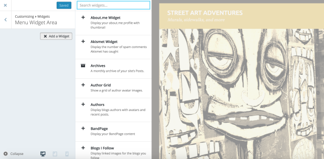
When you visit the Widgets screen, you’ll see a list of all the available widgets on WordPress.com:
It’s a good idea to strategize about the number and order of widgets on your sidebar: just like with your posts, your readers will pay the most attention to the first couple of items they see. What’s the most important information you want to guarantee your visitors read? What actions would you want them to take? Answering these questions will help determine the best way to design your sidebar.
The sidebar as compass
When people reach your blog, they most likely see your most recent post (or a sticky post, if you’ve set one). You can use the sidebar to make it easier for visitors to navigate to other sections of your site. If you look at our sidebar here at The Daily Post, the first thing you’ll notice on top is a simple Text Widget greeting our readers and briefly explaining what we’re all about; it’s the blogging equivalent of a welcome mat (naturally, you can write whatever message you want: Text Widgets are extremely versatile).
You can use the sidebar to make it easier for visitors to navigate your site.
Going down our sidebar, next you’ll find the Search Widget: when a site has a lot of content, it makes it easier for visitors to dig through your packed archives, looking for a specific term.
Other blogs can use different tools to direct readers to the good stuff they’re looking for. For example, the popular Archives Widget groups your posts by month, while the Categories Widget does the same by — you guessed it! — categories. Think about the overall structure of your blog, and let it guide your widget selection: make it easy for visitors to find what they want (you can find additional ideas here).
Let the widgets lead the way
A sidebar can be used as more than a simple map. You can design your sidebar so that it guides your visitors to the content that you want them to see. Look to the right of your screen once again: those beautiful Image Widgets? They’re there to lead our loyal readership to the features they like the most: for example, Photography 101 tutorials and writing challenges (You can find more info on creating Image Widgets here).
You can also deploy Image Widgets as a subtle, yet effective way to reinforce your blog’s brand, or include badges and logos from the blogging events you participated in, using the widget as a link to the event page.
Think about the content you want to put in front of your visitors, and use the sidebar to make it easy for them to find.
Continuing down our own sidebar, we want you to be able to reach our most popular content easily. Enter the Top Posts and Pages Widget, which lists our most viewed content (on your site, you get to choose how many items to feature: top three? A baker’s dozen?). You can also prolong the shelf life of your posts by linking to your most recent ones in your sidebar, using the Recent Posts Widget. In short: think about the content you want to put in front of your visitors, and use the sidebar to make it easy for them to find.
The social sidebar
We covered the many ways your sidebar gets your readers more engaged with the material already on your blog. You can also use it, however, to make sure they return in the future. The Follow Blog Widget gives your audience a one-click option to view your future posts on their Reader (we have it, too — it’s our third widget from the top!).
The sidebar is also the place where you can connect your blog to your other online activities and social networks.
The sidebar is also the place where you can connect your blog to your other online activities and social networks. Are you an avid photographer? The Instagram Widget and the Flickr Widget will stream your latest masterpieces directly into your blog. Are you an active member of a blogging community? Share some love with your friends using the Links Widget, commonly known as a blogroll!
The sidebar and the widgets in it are not separate from your content — they’re there to make it more accessible and more engaging. Picking the right combination of widgets for your blog might take a bit of trial and error, since no two blogs are the same. It’s a process worth diving into, though, as the rewards are real, and significant.
What are your favorite widgets? How do you maximize the efficiency of your sidebar? Have you seen any popular widget used in a particularly clever and original way? Share your wisdom!
You might also enjoy these related posts:
Currently blogless? You’re a click away from sharing your story.
Create your blog at WordPress.com


I love my sidebar… I find it quite a useful part of my overall blog look and feel – I dunno what you guys think – unclespikes.wordpress.com. The only bugbear is that you are restricted to only certain widgets with some themes.
LikeLike
Will Oscar let me keep my sidebar? I keep it for sticky posts and as navigation aid to categories.
LikeLike
Hi there,
Your blog is a powered by WordPress.ORG install and this is WordPress.COM information being provided here though some is transferable.
LikeLike
I feel that the sidebar should be minimalistic – 3-4 widgets (max) highlighting the most important actionable things should be sufficient. Non-important widgets can be put in the footer (if the theme supports it).
I have seen one useful widget in Blogger – It lists the most recent posts of all the blogs that the blogger follows – Most recent posts being on the top. I wish there was a default WP widget enabling a functionality like this, especially as Google reader is no longer available. This widget is like a public google reader that can be useful for anyone who wants to check-out some new posts from an immediate (trusted) network.
LikeLike
I agree with what is written here. Too many widgets makes it extremely distracting.
shreyapunj14.wordpress.com/
This is my bog, any advice on the side bars?
LikeLike
I was just struggling with this last night! I can’t wait to go home and re-visit. Thanks for the info!
LikeLike
Glad the timing was right for you!
LikeLike
Thanks for an extremely helpful post. I’m planning big changes for my heathershelsinki.wordpress.com – Now I have a good plan for which widgets stay and which ones go.
LikeLiked by 1 person
Thanks for the tips. I was recently wondering how I should arrange my widgets, so this post came in time.
I just wonder what the grey boxes in the middle of the paragraphs are called.
LikeLike
I’m glad you found the post helpful.
The text ‘boxes’ are breakout quotes, similar to blockquotes only aligned to one side. How they actually appear on the page, though, varies by theme, so you might want to experiment a bit.
LikeLike
Oh, I think I get! Thanks a lot! 🙂
LikeLike
I also agree when it comes to widgets and sidebars – less is more. Cluttered sidebars not only detract from professional blog design and render a blog as amateurish in appearance, they are also a distraction that draw eyes and minds away from blog content.
One of the worst practices I see cluttered sidebars full of long blogrolls and or Tweets and our Facebook icons. Surely by now blogger know reciprocal links have negligible value. More to the point, is that any more than 100 links on any page (yes that includes sidebar links and image links too folks) will send search spiders off to report that your site is a possible link farm.
I disable all sidebar display on all static pages and strongly prefer to use blogs designed not to display sidebars on posts when displayed on their own pages, or on Archives or Categories pages. The test I use to determine whether or not to add a widget or any sidebar link to my blog is to answer these questions:
1. Will adding this widget or link to my sidebar enhance my visitor’s reading experience?
2. Will adding this widget or link to my sidebar provide my visitor’s access to blog content that’s not found on the front page of my blog?
3. Will adding this widget or link to my sidebar provide my visitor’s access to additional high quality related resources beyond my blog?
The rule of thumb is that if I cannot answer yes to all three questions then I do not add the widget.
LikeLike
Thank you for the perspective and incisive tips, Timethief!
You raise many important points; as for widget visibility, we’re planning to address that topic specifically and in detail in a future post, as it’s such an important feature of widgets.
LikeLike
Thank you – I’ve been pondering ways to use widgets to communicate more effectively. Pat
LikeLike
Thanks for the tips, I will revise my sidebar accordingly.
LikeLike
Great post on using the sidebar, thanks for the good info. I must say I like the 2013 template footer-bar (if that is what its called). =D
LikeLike
Yes – a footer widget area is a good alternatives for 1-column blogs or for anyone who wants (or needs) to avoid a sidebar.
LikeLike
My blog is mainly but not exclusively about food so I play both with my menu and widget bars to make it easy to find a recipe idea. There are actually a few themes whre I love the design but am not using just because of the absence of easily visible widgets and/or menu (then again, my sidebar is not visible in the 1st page..).
Maybe if I had a different type of blog I c wouldnt worry so much.
Thanks!!
LikeLike
I think you did a great job setting your priorities: it’s a wise idea to start with the features that are most important to you, then tweak and customize the theme to look the way you want it to.
LikeLike
Thank you Ben! Actually I have tweeked and customized it quite a bit… oh to make it quite minimalist looking too 🙂
LikeLike
Huh, it feels like I need a sidebar but I don’t want to put too much widgets. I’m still trying to figure it out. Maybe someday I’ll meet my perfection 😉
LikeLike
Trial-and-error is really the way to go. Or asking a fellow blogger to take a look — that never hurts, either.
LikeLike
I think less is more. That’s why I have only categories, archives and a lil image. Today I added Facebook Like Box but I think I’ll get rid of it 😉
LikeLike
Bring out the pruning shears!
LikeLike
Lol, I think my mouse is enough 😛
LikeLike
I’d love to move my side bar to the right but I don’t see how. Can you help? My theme is “Beaches.” Thanks.
LikeLike
If you’re using the Beach theme, I’m afraid it comes only with a left sidebar. If you want to make sure your theme has a right sidebar, click on the link in the first sentence of the post — it will lead you to a list of themes featuring a right sidebar.
LikeLike
~ The Recent Posts and Categories widgets are the best for me. Imho, placing these widgets on the upper part of the blog is easy on the eyes. Putting Categories widget on top is okay too, since some people would rather navigate through their chosen categories rather than selecting a topic/title the moment they landed on a blog. Cheers! – Bliss, The Lurker’s List
LikeLike
Thanks for the advice!
LikeLike
Thanks for the tips! Love widgets 🙂 Though I do try to refrain myself from using too many.
LikeLike