Way back in January we set the scene for talking about how visually branding your blog can set it apart from the pack. In today’s follow up we’ll look at one of the hands-on ways you can make that happen — by customizing your headers and sidebars.
Getting Hands On
In our introductory post we worked on generating some broad ideas about how you could visually represent your blog. Now that’s out of the way, let’s get hands on in putting those thoughts into action. In future posts, we’ll look at how you might want to explore the Custom Design Upgrade and go to town on custom typefaces, tweaking your CSS, and really getting stuck into tweaking your color schemes to suit your taste. But to start with, it’s amazing how big an impact playing with the header of your blog can have, and getting creative with image widgets can add to the effect. Better still, both are baked right into your blog whether you have upgrades or not.
Headers
Chances are the header of your blog is what people will see first when they arrive to have a look around. Think of it as your store front, your book cover, and the “face” of your blog all rolled into one, and you’ll quickly appreciate how important making a first impression can be.
The extent to which you can change the header of your blog will depend on the theme you’re using, if your theme even has a header, so that’s worth bearing in mind. But whichever theme you have on your blog, you’ll be able to get at the header from your dashboard by *cough* heading to Appearance > Header. If that option isn’t available, chances are you don’t have a theme that has a header in the first place. In that case, you’ll either want to consider switching themes, ignore the whole header business, or check out the Appearance > Theme Options to see if there are other tweaks you can make.
We won’t go into the nitty gritty of header editing here, because there’s a support document all about that. Instead, we’ll take a look at some creative examples of headers that might spark a few ideas for your own design.
Header Inspiration
If you’re stuck for ideas as to how you could make your header work harder for you, here are a few ideas from fellow WordPress.com bloggers:
Explode the Box
One way you can make your header stand out is to stop thinking of it as a rectangular slab of color or a boxy slither of photo.
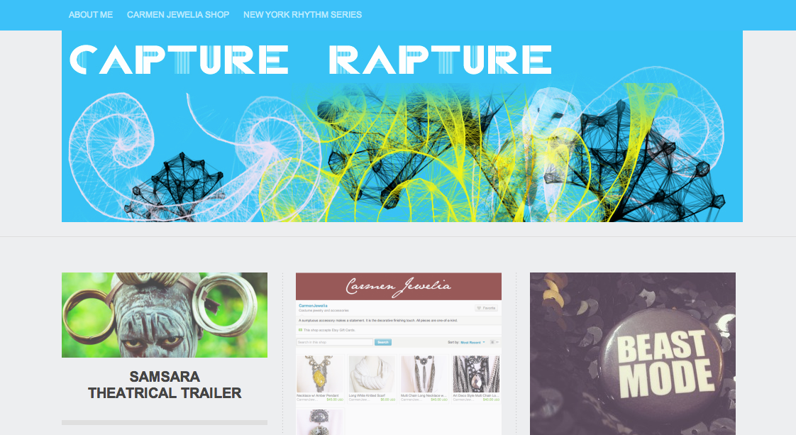
On Capture Rapture, the header blends seamlessly into the navigation bar at the top, creating more of an impact. This has been achieved by setting the navigation bar to a custom color, an option available to users of the Triton Lite theme, and then using the exact same color from the navigation bar in the header image.
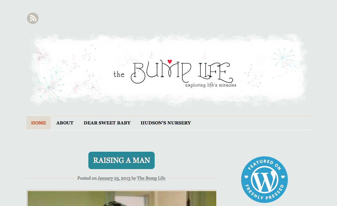
The Bump Life takes a different approach to the same concept, by nibbling away at the edges of the header “box” using the same color as that used for the background, creating a slightly distressed, painterly look to the header:
The design of Small World Supper Club rounds off the edges of the header by using the same white as the background color.
So there you have three examples that look completely different, but nevertheless manage to break out of the boxy, typical header approach by matching the color at the edges of their header images with that of the background or navigation bar elements of the blog.
Signature Look
Another approach to personalizing your header is to hand write, draw, or letter your blog title in such a way as to create a personal “signature” that nobody will mistake for another blog. The good news for those of us with illegible scrawls rather than beautifully formed letterforms is that you can always cheat and make use of any of the hundreds of freely available handwritten font styles out there on the web.
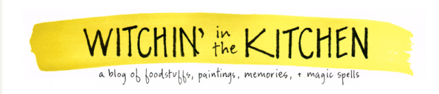
Witchin in the Kitchen makes use of freehand titles and taglines that instantly sets it apart from the pack — after all, what’s more personal than your own handwriting?
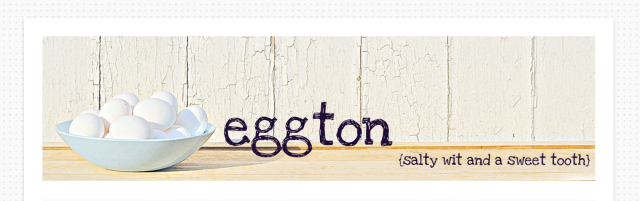
While Eggton and American Vagabond take the photo-header in a new direction by introducing bold, freehand typography into the mix, again, setting their blogs apart from those using the standard system font, at the standard size, in the standard location:

Playful Typography
As the hand written examples above show, you don’t need to settle for a run-of-the-mill typeface for your header, such as the one included as default in your theme. In addition to being able to customize your fonts via the Custom Design upgrade, you can also take your type in bold, image-driven directions with a little imagination:
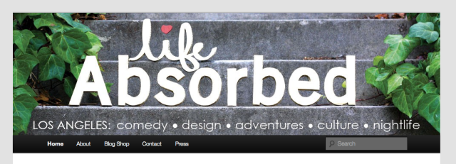
Life Absorbed uses a photo header, but the photo is of a hand-made, three-dimensional cardboard model of the blog’s title. Not something you see very often:
Sage + Clare makes beautiful use of bold, high-impact typography and a beautiful masking effect to color the type in a unique and original way:
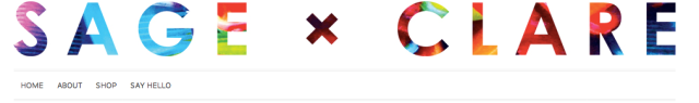
Image Widgets
Headers are the neon hotel signs of blog branding: up front, bold, clearly distinguishable, and ideally, captivating at first glance. Creative use of image widgets, on the other hand, are more about the details, like the interior decor of the same hotel.
The technique we’re interested in here is replacing vanilla lists of pages or categories on your blog, with unique, branded images that can be clicked on to take people where you’d most like them to go. It’s easier shown than described, so in a moment we’ll jump right into some great examples. You can read everything you need to know about setting up your own image widgets on the WordPress.com support all about them.
In brief, the steps look a little like this:
- Make sure you’re using a theme that supports widgets. If you aren’t, when you head to the Appearance menu from your dashboard, you won’t see Widgets as an option. In that case, you’ll either need to change themes or forget about using image widgets. The good news is that most themes will allow you to use widgets. Huzzah.
- Create one or more image widgets. You can do that from the Appearance > Widgets menu. If you’re not sure what that even means, or how to go about it, head to the support doc all about widgets and you’ll be up to speed in a minute or so.
- Upload some images for your sidebar. You’ll get some ideas about the type of thing you might consider in the examples below. If you’re not sure how to upload images, head over to this support doc on the Media uploader tool.
- Point your image widget at the image you want it to display. If you get stuck with that, check out the image widget support doc.
- Add a link (optional). If you want your image widget to take readers to a different part of your blog, you’ll want to add a link to the place you’d like them to be taken before saving your widget.
Ok, enough of all that. Let’s see how WordPress.com bloggers are making creative use of image widgets.
Image Widget Inspiration
The key to image widgets that work effectively is making sure that they match the overall look and feel of your blog. Pay particular attention to the header (are they using the same color scheme, the same typography, or playing off one another?) but also consider how they sit with the palette and overall look you’ve created through your choice of theme and other design decisions you’ve made.
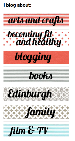
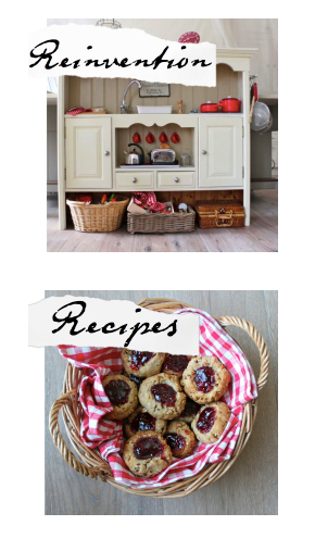
Debbie Does Doodles and Kate’s Creative Space reinforce the themes of their blogs in a visually inventive way, using images and typography for sidebar navigation that underline a focus on art, crafts, books, and paper-based media:
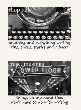
Adventures of a Wannabe-Writer underlines the focus on the act of writing by using strong black and white images of writerly objects, along with a hand-written font that adds a personal, writerly flourish to proceedings. While Design by Lulu makes great use of a single color and unified design aesthetic to tie together header, sidebar and the other design elements of the blog.
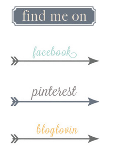
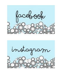
One Young Love and Miss Zoe find creative ways to draw their readers’ attention toward their other social media streams, at once personalizing and underlining these other spots on the web that interested site visitors might want to check out next:
More Sidebar Inspiration & Tips
If you didn’t catch them already, be sure to check out our earlier Widgets 101 and Widgets 201 posts for some great tips on customizing your own sidebar.
Show and Tell
So hopefully that’s demonstrated that by spending a little thought and time on the look of your blog, principally through the use of headers and image widgets, you can really underline the themes you’re writing about, create a memorable, stand-out brand for your blog, and attract the eye as well as the mind.
We’d love to see how you’ve added some visual identity to your blogs. Link them up in the comments and let us know what you think.
Currently blogless? You’re a click away from sharing your story.
Create your blog at WordPress.com


I recently updated my header to a rotating series of images – I was initially really pleased because I think they pop a little more, but for some reason the font wound up looking slightly pixelated. It was so much to create them that I haven’t found time to fix them…
Also, at least one of them basically requires you to be familiar with the blog to get the joke, and that might not have been my best move.
LikeLike
This is a great post, given me an idea if what I now need to do to achieve the perfect header, thanks;)
-mydogblog09
http://mylifethroughtheeyesoftheweb.wordpress.com
LikeLike
My Saturday just got a little more interesting.
LikeLike
I recently changed my header (in fact I changed my whole theme, since the original didn’t fit the header very well), and I’m loving it! It just makes the blog so much more unique. Thanks for the tips!
LikeLike
I put my header on random — but the only differences between the randomised images are the taglines. I don’t think anybody’s noticed yet, perhaps a bit too subtle. Tee hee hee.
LikeLike
These posts have been so helpful. After reading them I have changed my header and then after MUCH debate the background. I don’t like it when you find backgrounds that overpower the rest of the site, they are supposed to be backgrounds after all :). I’d love to see some more ideas using the new “visibility” button on the widgets. I have some ideas but these posts are always inspiring!
LikeLike
Hi friend, I’m having one problem . Whenever post link of others blog form by inserting from URL. It comes in my blog but when I try to connect to that blog from my post it does not connects. Other bloggers are also facing same difficulty to connect to link given from my blog. Can you please help me. Regards.http://amaltaas.wordpress.com
LikeLike
Hi Indira. Apologies in advance if I misunderstood your question — it sounds like links aren’t showing up as links when you post them to a blog post (or sidebar?). In the case of posts, check that you aren’t trying to post html links in the visual editor. In the case of the text editor for posts, or sidebars, you’ll need to use html links for them to work. You might find this support document about links in WordPress.com useful.
If that doesn’t help, be sure to get in touch with our support team for further assistance.
LikeLike
Hi Michael, Thanks for you reply. Like I participate in Weekly Photo Challenge, I copy link from there and insert in my post. links are showing in my post but if you go to that link from my post then it is not possible. I’ll try support document. Thanks again.
LikeLike
Huh, looks pretty good. I guess I’ll get some ideas from this post…after all, a nice visual design helps people come to the blog 🙂
LikeLike
Reblogged this on Kevs' Blog.
LikeLike
Reblogged this on teacupsandraindrops and commented:
I am gonna have to try these. I’m not extremely tech-savy but I love personalised sites 🙂
LikeLike
I modified the Publish theme for a relatively understated blog page: http://chanroberts2.wordpress.com/
LikeLike
Well, now I know that there’s still a lot I need to learn about blogging and what goes with it… 🙂
LikeLike
wow, how cool is that! I didn’t realize a widget image could be used as a catagory link!
LikeLike
WOW! I want to do ALL these things….hah, but I don’t have the talent or networked abilities to find someone to make these changes for me. Is it all about finding the right people to help us to make these changes?
LikeLike
i found this extremely useful..thanks..
LikeLike
Lovely!
Great concept!
I believe looks add a lot to how blogs are perceived. Links on images on the sidebars also make a lot of navigation handy.
I so much appreciate the tips. I’m probably saving them up for a good day. 🙂
LikeLike
It’s actually very complicated in this busy life to listen news on TV, thus I simply use internet for that reason, and obtain the latest news.
LikeLike
I just put a BG image but not sure if it’s too busy or the words being incomplete…are not quite right….any comments…??
http://hometogo232.wordpress.com/
LikeLike
I made up my mind it was too busy…and deleted it…I’ll have to look for a better one…Diane
LikeLike
You’ve done a great job with your 3 column layout, text and links!
LikeLike
I really appreciate all the tips from DP and thanks for your feedback…Diane
LikeLike
I have absolutely NO SKILLS whatsoever in regards to graphic design or drawing. I did look into the option of using my own photos, as well as free to use images to give a unique feel to my blog, but couldn’t find what I was looking for. And I spent hours trying to create icons and logos without being satisfied.
So I decided to collaborate with a great gal I met at Montreal Comiccon last year, Isabelle Angell, to create logo and an avatar for my blog and social media. I did have to spend a little money, but the finish product is 100% mine and I can use it anywhere and how I please. Plus, I really like her artistic style. So I’m saving a little money to have my own logo drawn by her too, soon I hope!
If I ever had the time, I’ll take a photoshop class. It’s a great investment for bloggers and academics alike!
TGA
LikeLike
Sometimes outsourcing is what it takes. We can’t do it all ourselves. I do some graphics, but it’s not my favorite thing in the world to do.
LikeLike
I would love to create my own designs, I just don’t have the skills and the time to acquire them yet. Until then, I still really like my logos!
LikeLike
I also like your logo 🙂
LikeLike
Thanks, eventually if I can get to your level I’ll create my own stuff! 🙂
LikeLike
Nice response in return of this matter with real arguments and explaining everything about that.
LikeLike
The header function is one of my favorite functions. I change mine every week! 😀
LikeLike
When someone writes an piece of writing he/she retains the plan of a user in his/her brain that how a user can know it. So that’s why this article is great. Thanks!
LikeLike
Good info, but odd examples. You say “On Capture Rapture, the header blends seamlessly into the navigation bar at the top…” I clicked the link, but it does not.
LikeLike
Thanks for letting us know! Those are the perils of trying to hit a moving target. At the time of drafting this post, the header and navigation bar looked like the screenshot included.
LikeLike
I know what you mean and “moving targets” – i love that!
All the best and, yes, the image you included did make it clear what you were explaining. Keep up the good work! 🙂
LikeLike
I’ve changed my header into gif thing. Yeah I googling “how to make gif” then I tried it. Hopely it works.
But, I don’t understand yet to make cool widget, look like it the post.
Could you give me some advices?
Thanks I do really appreciate
LikeLike
I loved the idea of using the background color to give the header a unique edge, so I tried it. very pleased with the results. 😀
LikeLike
Wish I had time to play with mine. I want grizzly bear paw prints on my blog and then it’s perfect to me!
LikeLike
Thanks for this great post and terrific inspiration. The tips are clear, and I loved the blog tour that came with them!
LikeLike
Cool ideas! Am designing now. 🙂
LikeLike
I appreciate this article. I also read through the links on image widget feature. I already have top pages and posts widget with associated images.
I have hand-picked feature sample links in a text widget, but fear that using an image per linked post, will create more clutter. I dunno. What do people think?
Visual branding requires very strategic, judicious use of image areas on branded static areas of the blog page –header, side bar and footer even. Otherwise it starts to look cluttered.
Also if one links to multiple blog posts with each an image in an image widget, wouldn’t that slightly slow down the downloading of blog to readers’ screens?
LikeLike
I agree with you about having too many image links. I think another thing you could do is separate your links into categories. For example, someone could have an image link that takes you to a page of posts about food…and that page could then have either image links or word links to individual posts in that category. Kind of like how a drop down menu is organized…but using image links.
LikeLike
Dumb as this may seem, I never thought of that before. 🙂
LikeLike
Wowza! Thanks for featuring Small World Supper Club’s header! : ) Huge props to Alana Cherup of Cheerup Cherup for the image.
LikeLike