
Backgrounds are just there. They’re the stage sets to our existences, and, as it happens our blogs. As humans, we’re more often far too interested in what’s going on center stage to give a damn what’s going on in the blurry, insignificant old background. Sword fights! Riots! Beautiful people! Dancing cats! Mars Rovers made out of chocolate! The background has a hard time keeping up with all that drama.
The thing is, while they’re never going to steal the show, backgrounds play a subtle but important role in setting the mood, tone, and feeling of any given scene. And your blog is no exception. So today, we put on our best overalls, get the roller out, and think about the joy of custom backgrounds.
I’m not going to bore you with too many technical details, because you can find them all in our handy-dandy support doc on Custom Backgrounds.
No, wait. Come back.
The main thing you need to know from a technical point of view is that if your theme supports Custom Backgrounds, you’ll have a “Background” option under the “Appearance” menu of your dashboard. It will probably look a bit like this:

If you don’t have one, move along. Or, erm, get a new theme. Luckily, most themes support them, so let’s assume you’re on board.
Now, as you’re armed with the right menu option to head to, the will to experiment, and a support doc on the minutiae of Custom Backgrounds, let’s put aside the how and instead think about the why:
Standing Out
There are hundreds of themes on WordPress.com, but there are also millions of bloggers. If you want to stand out from the rest of them, you’re going to want to make a bit of effort to customize the look and feel of your blog’s design. Changing the background is about as easy as it gets. Head to the Appearance > Background menu, and, um, change the background!
Here’s a great example from New Girls About Towns:
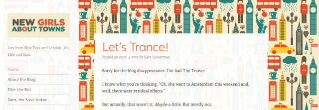
It makes all the difference to see a custom background, rather than the one used by default for a theme, and in this case the colors are vibrant, but also matched to those of the logo and headline typography.
If you want to stand out, then, you don’t need to pick a garish day-glo green, or that tiled repeating background with Santa’s head on it. While you might decide that those are winning options for you, first you’ll want to think about:
Setting the Tone
Is your blog about Axe Murderer Movies of the 1970s? Then, yes, that repeating blood spatter on a bright yellow backdrop might just reinforce the tone you’re trying to convey with the content in your posts. If, on the other hand, you’re writing about The Exquisite Elegance of Parisien Couture, Circa 1958, well, you might decide to choose something a little more gentle. Or, you know, elegant. Restrained. Or black. Because black is timelessly chic, n’est pas? Regardless, steal from the best by seeing how the designers of sites, books, films, or products choose to set off their work.
One Theology does a great job of tone setting through the minimal use of typography that repeats the key themes of the blog, as featured in the tagline, both in statement and in using a paired typeface that holds things nicely together:

So you’ve considered how to stand out without sticking out like a sore thumb, and how to hint at the tone, mood and content of your header. Before you finish, think, as both of our examples have so far, about:
Unifying Your Site’s Design
Too many colours, too many patterns, too much wild crazy action in the background, make for a busy, busy design that distracts the eye from what really matters. Remember, the background is there to gently reinforce the content in your posts. One way to do that might be to unify the background colour (or image, or pattern) with the colours featured in your header, for instance. Is your header image a pig’s head with an axe in it? Sample one of those Francis Bacon fleshtones with a browser-based color picker (here’s one if you’re using Chrome or Firefox) or else eyeball the rough colors of your image to find something complementary for your background. Boom! Instant design harmony.
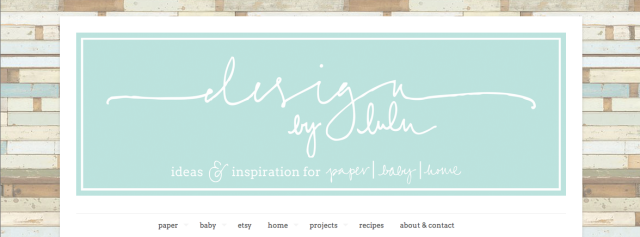
Design By Lulu is a great example of how, even with a repeating textured pattern, you can tie the header of your blog into the color scheme of your background to unify your site’s design. In this case, note how the pastel blues of the header are mirrored in some of the background, with the rest of the background colours proving complementary:
Moar Inspiration?
Check out Cheri’s post over on en.blog, where she talks through some of the design decisions made by bloggers tweaking the backgrounds on their blogs.
Over to You
Have you customized your background? How did you decide on the colour, pattern, or image you chose? Let’s see them!
Currently blogless? You’re a click away from sharing your story.
Create your blog at WordPress.com


Hi Michael,
I customized my background. Using a piece of hand-made paper, I took a photograph of it and adjusted the color and size of it digitally and loaded it in as my background. It was easy. What do you think? Does it “go” with my theme of intrinsic learning?
check it out at kristinshermanolnes.com
LikeLike
I checked out your site. Background disappears once everything loads up. I’m seeing it on a 14″ laptop screen, so that might have a LOT to do with it. Might look different on a widescreen monitor. 🙂
LikeLike
Love it. Great Job. Thanks for sharing.
LikeLike
I like the whole idea of a custom background, but I’m having difficulty finding anything that fits. Is there a way to avoid the tiled (repeated) background? And where do people get those awesome backgrounds?! It’s so hard to find a background that doesn’t distract from the content but can elegantly supplement the look of the blog. Any tips?
LikeLike
Hi Christrocks
I got round the repeating pattern by setting my background “Display Options” in the Appearance-Background section of the Dashboard. Repeat = Tile and Attachment = Fixed. This means that when I scroll down the page, the background image stays in place and it is the posts and the widgets that move. This gives me a cleaner running page – which is what I wanted.
You can see what I mean here: http://mightwar.com/mightwar-songs/
LikeLike
Looks great!
LikeLike
Me too i’m interested in setting up a background whitout the tile. Very inspiring article by the way 🙂
LikeLike
I don’t like the tiles either. I have tried a number of backgrounds but find them too distracting. As with Christrocks and C.OTSE I would like to know how to have a plain background. Currently mine is just a relaxing violet.
LikeLike
The most important thing to consider is the size of your image. If you have a small image, it will not look right on larger screens such as a laptop or desktop computer without tiling the image, so make sure you have a large enough image. If you are pulling your image off the web, a good size is 1200 x 1000.
If possible, go to the ORIGINAL image (if you are searching through google you should be able to, once you’ve actually selected an image, be able to click a button that says view original image) so that you get the largest version of the image possible. You can always crop an image, its much more difficult to make an image larger than it already is.
Once you’ve decided on a starting image, click and drag it to your desktop and make any changes you want to make in your favorite photo editing software, then follow the instructions in this original post to upload it to your wp background page.
After you have uploaded the image you want to use, on the background page in wordpress a series of options labeled Display Options will appear at the bottom after you have uploaded the image you will want to use. Select Display Options > Position > Center, Display Options > Repeat > No Repeat, and Display Options > Attachment > Fixed.
Then go check out your page to make sure you like the way it looks!
LikeLike
I should also add that if you are using your own image, you should be able to use virtually any image taken with a digital camera and not have to worry about the size of the image.
LikeLike
I customized my blog’s background (http://pindsha21.wordpress.com) to match my website: http://www.shavannapinder.com
LikeLike
I love a lot of the backgroundds, but I post a lot of photography and no matter how many different backgrounds I’ve tried, I always revert to a neutral, usually black or dark gray background. These don’t fight for attention with the photos and tend to flatter the pictures. I often wish I could use something more entertaining, but it doesn’t seem to work with photography.
LikeLike
I agree and like an all white background when photos are posted. If a blog is more text than image I can understand the whole background thing but for now I’m going with art gallery white walls theme!
LikeLike
I like light I like white – agree that anything not plain and contrasting simply distracts from images
LikeLike
I agree. Nothing should distract from the image in a photo blog. I actually changed my image widgets to text-only while I had an artist friend as a guest blogger, then changed back when her content was no longer current. It’s that important.
I really like a couple of themes that automatically do the color-pick for you and work as a very wonderful framer friend who knows the art. Just like perfectly matched matting for the background. Mmm. . .
I would choose one of those (wish I remembered the names) if I actually did a photoblog.
LikeLike
This would be a great Community Pool this weekend! I’d love feedback on the images I’m playing with on my Choco theme.
LikeLike
I already have a custom background which I like…not changing it. So there 😉
LikeLike
I was just thinking about creating a background to keep my photos from just floating in space.
LikeLike
Good idea – I never thought of this until you raised the point. Cheers! 🙂
LikeLike
Since my blog is about brain-type stuff, I made my background (and my header, BTW) out of photomicrographs of fluorescent antibody-stained rat brain cells, courtesy of my neuroscientist son, who likes to make art in the course of doing science. Yay! http://bipolarforlife.me/
LikeLike
Since mine is just my space to share my thoughts, I found need to make it myself.
Of course, I’m the little girl who thinks glowing mushrooms in varying blues is always a wonderfully fabulous idea.
It was made using my larger computer as a reference, so you’re going to want a pretty big screen to see all of it, but it crops nicely :>
Best part? Since I drew it, it matches my header too! 8D
http://amayayumescorner.wordpress.com/
LikeLike
I love that you drew it yourself! And yes, glowing mushrooms IS a fabulous idea.
LikeLike
Thank you. I just join and I wanted some helpful infomation. Thanks for posting.
http://cherryteablogblog.wordpress.com
LikeLike
I want grizzly bear paw prints on mine. How do I do that?
LikeLike
The reason I don’t have a background is because I want to make a custom background and header that relates to my blog. Maybe create a logo for “The Coalition” and the movement of No Disappointments.
I am currently asking a friend to design the logo and backgrounds. Does anyone know of a free site or software that lets you customize a simple background or logo?
Thanks.
LikeLike
A custom background is a must, I think, for helping to establish a first impression you want to convey. It speaks, without saying a word, who you are. http://wordsofautumn.wordpress.com/
LikeLike
Wow! Not only is your blog great, your song Gloriously Autumnal, is beautiful and haunting! I love it! You are really talented!
LikeLike
I just tweaked my background with one of the freebies recommended on the Custom Background support doc. Any comments? Is it too loud?
LikeLike
Hi Eda, I really like the header you have and I feel that the blue background may be a little too whimsical for the overall look and feel of your blog. When I see your header, I think of steel or modernity. I do like the body of your blog and the fonts. Anyway, that’s my humble opinion.
LikeLike
Thanks for the input, Clever Girl, and good point. I wasn’t sure the background went with the header, but come to think of it, the text is fairly whimsical. I’ll give it a think.
LikeLike
What a great topic. And I love some of these ideas. I just took a textural photograph that could repeat as a nice wallpaper. But some of these ideas are really creative and effective. I might change things up and do a little branding now… Thanks for the great ideas folks…
LikeLike
I used to have a blank background, but then I opted for a subtle one-sided design that fades to solid colour, so there’s a bit of visual interest down the side but not enough to disrupt anything. People were unsure at first, but it seems to have settled in now.
LikeLike
I already did, just an old doodle with the color scheme that I love ,applied some effects and tada! makes for a cool background.
LikeLike
I will be looking to Customise, (unless I already have, LOL, D’OH), my Background asap.
LikeLike
thanks for the great tip! Just added a nice tile background and find my page much warmer 🙂
LikeLike
Hi
My blog highlights the latest developments in the biological sciences and how they will influence our future. I have a background that complements the educational nature of my content.
http://dreamerbiologist.wordpress.com/
LikeLike
Looks great!
LikeLike
Thanks for visiting.
LikeLike
I’ve changed my blog’s background, also the header
LikeLike
http://nybodphoto.wordpress.com/
LikeLike
Got inspired by your post, just added a black tiles (repeating) background and I think it looks awesome! thanks for the inspiration 🙂
http://wingedwizard.wordpress.com
LikeLike
In fact I’ve started working on photoshop to make a cool header that compliments and augments the background and in turn my whole blog 😀 (I think you guys should inspire us on that too!)
LikeLike
I just put a new background when I started my wordpress blog in jan, a vista which I liked. I need to dig in more on it
LikeLike
Hey Michael and all of you great bloggers, thanks for the topic and comments!
I had so much fun choosing the design aspects of my blog, but the background was the most difficult aspect of the whole process! It really has a lot to do with the entire feel of one’s blog and can immediately convey the blog’s purpose. Maybe some of you will take a moment to check out mine and let me know what you think.
Happy blogging!
LikeLike
I had a great custom background for the first 6 months of my blog and thought everything was hunky dory until a european blogger pointed out that it took forever to load on their end… Sometimes you have to forsake image for expediency and be happy that people want to spend time reading your posts/looking at your photos and not waiting for the cool background to come up. May try again though…
LikeLike
I have an eclectic range of interests. Should I go for any type of Custom Background in particular please?.
LikeLike
Trying out a generic one for now until I can find a photo I’d like to use for the background. It’s amazing how quickly it livens up my blog page! See here: sowenswrites.com
LikeLike